I love color! I love all colors and I always did. When I was in high school, I would spend all my days drawing in my agenda. By the end of the year, my agenda was spectacular. I don’t draw very well, but I added so much color on each page that it had a fresco feeling that was bright and happy. What I love even more than colors are colors combinations. I like the soft ones and the bold ones, and even if I don’t have one favorite style, I like my yarn combinations to be harmonious. I find that for a multicolor knitting project, the colors picked are the one thing that will make your project stand out… or not!
I split this post in two – the theory, and the feelings. My post about the feelings is coming soon…
Meanwhile, I’ll start with a little bit of theory. In my mind, picking yarn colors is a lot about feelings, and not so much about theory. However, it is easier to make thoughtful choices when you understand the theory behind the feeling.
The Color Theory and the Color Wheel
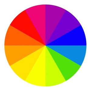
All the hues (the general colors like red, orange, purple, etc.) figure on a wheel called the color wheel. The basic wheel shows only the hues, not the tones, saturation, brightness, just pure colors. There are 12 pure colors on the color wheel: red, red-purple, purple, blue-purple, blue, blue-green, yellow-green, green, yellow, yellow-orange, orange, red-orange.
Primary colors are the ones that you can’t create by mixing other hues. They are red, blue and yellow.
Secondary colors are the ones that you can create by mixing only primary colors. They are purple, green and orange.
Tertiary colors are all the other ones. You can create them by mixing primary or secondary colors.
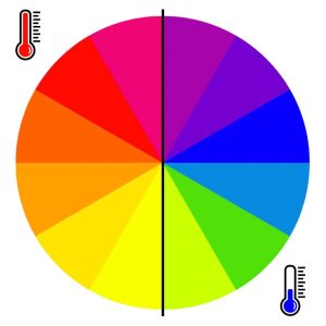
Creating yarn color combinations
Analogous colors
The easiest way to match colors from the wheel is to use analogous colors, which are the ones sitting next to each other. They are easy to mix together because they are like friends, always together, and they have a lot in common. They work well for basically anything. Analogous color combinations are usually pleasing to the eye, as there are lots of these combinations in nature.
It’s trickier to create a nice combination when matching colors from anywhere on the wheel, but some combinations work especially well. Note that when matching very different colors, the result is always bold.
Complementary colors
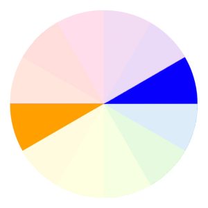
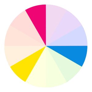
Complementary colors are opposed to each other on the wheel. When paired together, they create bold and contrasting combinations. They work well for kid projects, home projects, cheerful accessories and many more.
Triadic combination
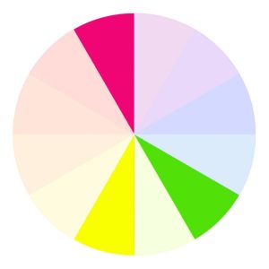
The triadic combination is the 3-color version of the complementary colors combination. To create this combination, you need to pick three colors that are equidistant on the wheel. With three colors, the result is harmonious and deeper than with two colors, but just as vibrant.
Split-complementary combination
Split-complementary colors is another 3-color variation on the complementary colors. This one creates softer combinations that are less contrasting than the complementary or triadic ones. To create a split-complementary combination, you need to pick one color, and then pick the two colors that are lying next to the complementary color of your choice.
Double-complementary combination
The tetrad, or double complementary combination, is a harmonious way to match 4 colors. To create this one, you need to pick one color, skip one, pick the next one, and do the same on the other half of the wheel. This way, you’ll have two pairs of complementary colors.
One more thing! You can always add a neutral color to any mix. By neutral colors, I mean the ones that are exempt of any hue, which would be white, gray and black. Beige, cream and natural yarn colors are great neutrals too, but they do have a little bit of a yellow or red hue, so use them carefully. Though they always work with warm combinations, sometimes they are not working as nicely with cold mixes. In these cases, I’d suggest using a cold gray instead of a cream.
Saturation and brightness
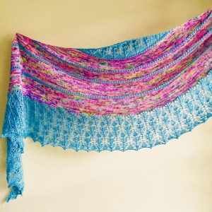
You probably noticed that most of my knittings examples aren’t as bright as my color wheels. This is because the wheels here are only the basic ones. However, the color wheel declines in more ways to create all the colors as we know them – not just bright red and bright orange, but also burgundy, rust or creamy peach.
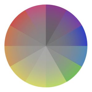
The first way to decline the wheel is to change its saturation, which is the pureness of a color. The more saturated a color is, the brighter it is. When you lessen the saturation of a hue, it loses its color and becomes closer and closer to gray, and therefore more neutral.
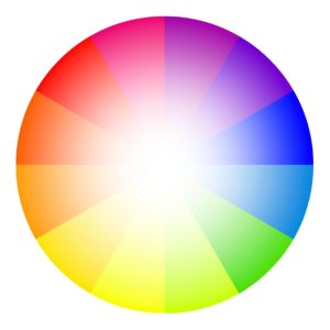
The wheel also declines in brightness, which is called tints and shades. The tints makes a color lighter and the shades makes a color darker. This is how you create colors that are always light or always dark, like pink or navy blue.
Color theory and yarn
When it comes the time to pick yarn color combinations, you can refer to these classic combinations from the color wheel, but use them lightly. Except if you’re knitting with very bold colors, your yarns will always have nuances that will make it impossible to decide if it’s more blue or blue-green. It’s hard to create the perfect triadic combo when your yarn isn’t a wheel-perfect color! So use these combination as guidelines or ideas, but trust yourself, and follow your feelings more than the theory.
That’s about it for the color theory!
The next time, I’ll talk about the feelings behind picking the right yarn color combinations.






The Comments
Margaret Golowenko
Thank you for explaining that. Your explanations have given me a strategy to help me to seek out a colour combination I like.
gabrielle
Margaret GolowenkoI’m so glad I could help! Enjoy your colorful work!